Proper Insurance
Problem
Proper Insurance needed a brand identity that reflected professionalism, trust, and reliability, core qualities in the insurance industry. Their existing visuals lacked consistency and didn’t translate well across everyday touchpoints like business cards, brochures, and promotional materials. As a result, the brand felt fragmented and didn’t fully support their client-facing experience.
Process
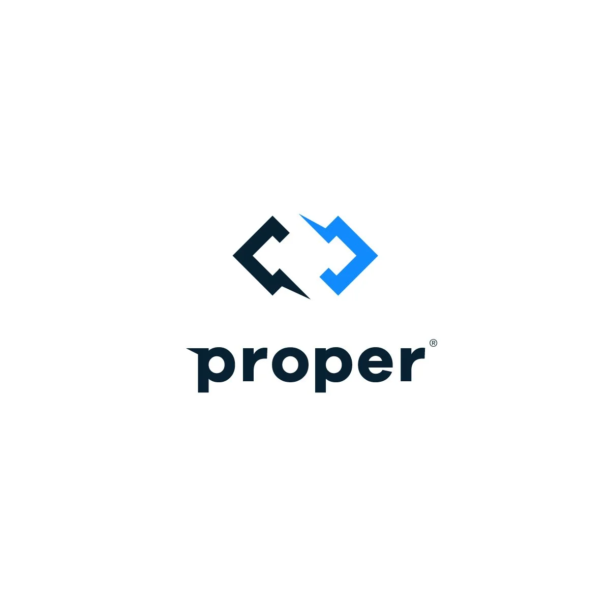
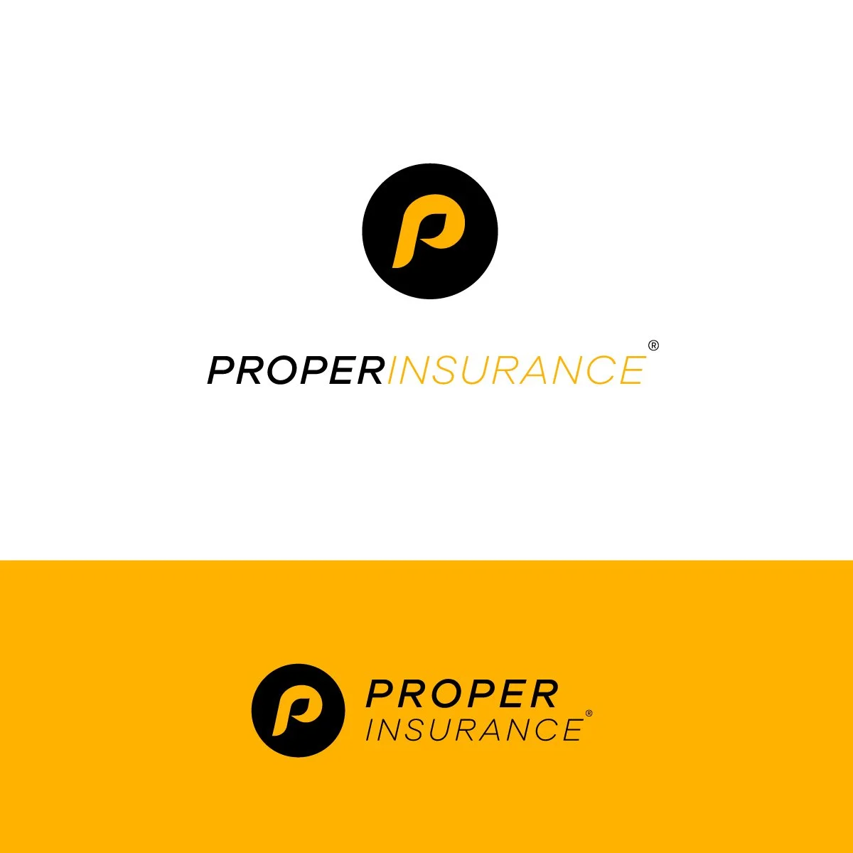
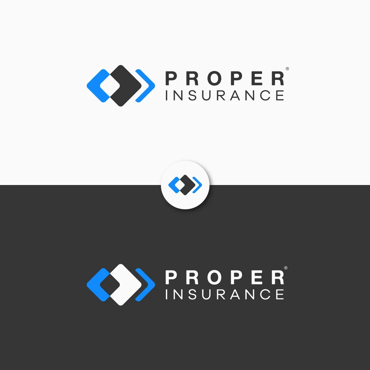
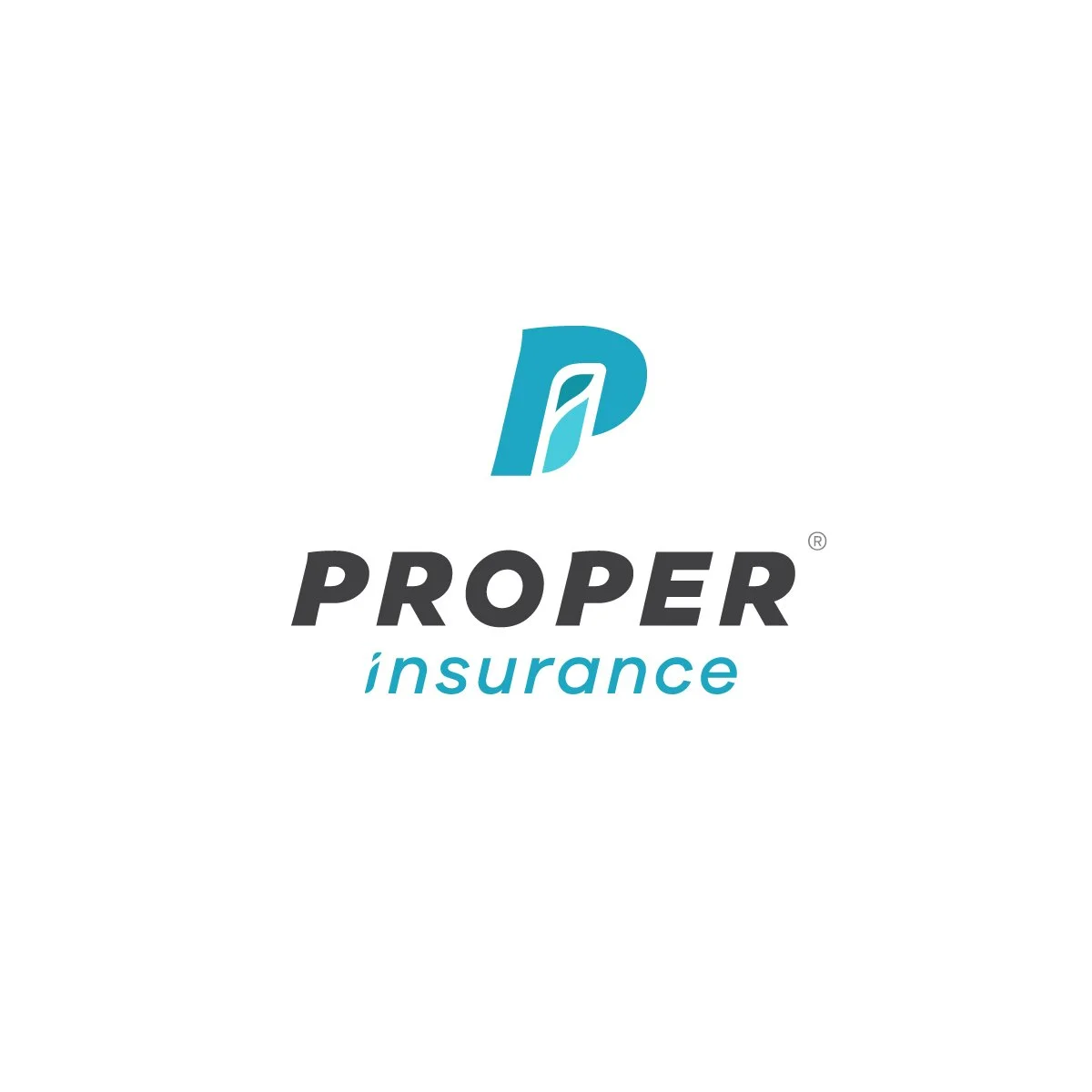
I began by developing a new logo that would serve as a strong, versatile foundation for the brand. The goal was to create something clean, recognizable, and appropriate for the industry, while still feeling modern and approachable.
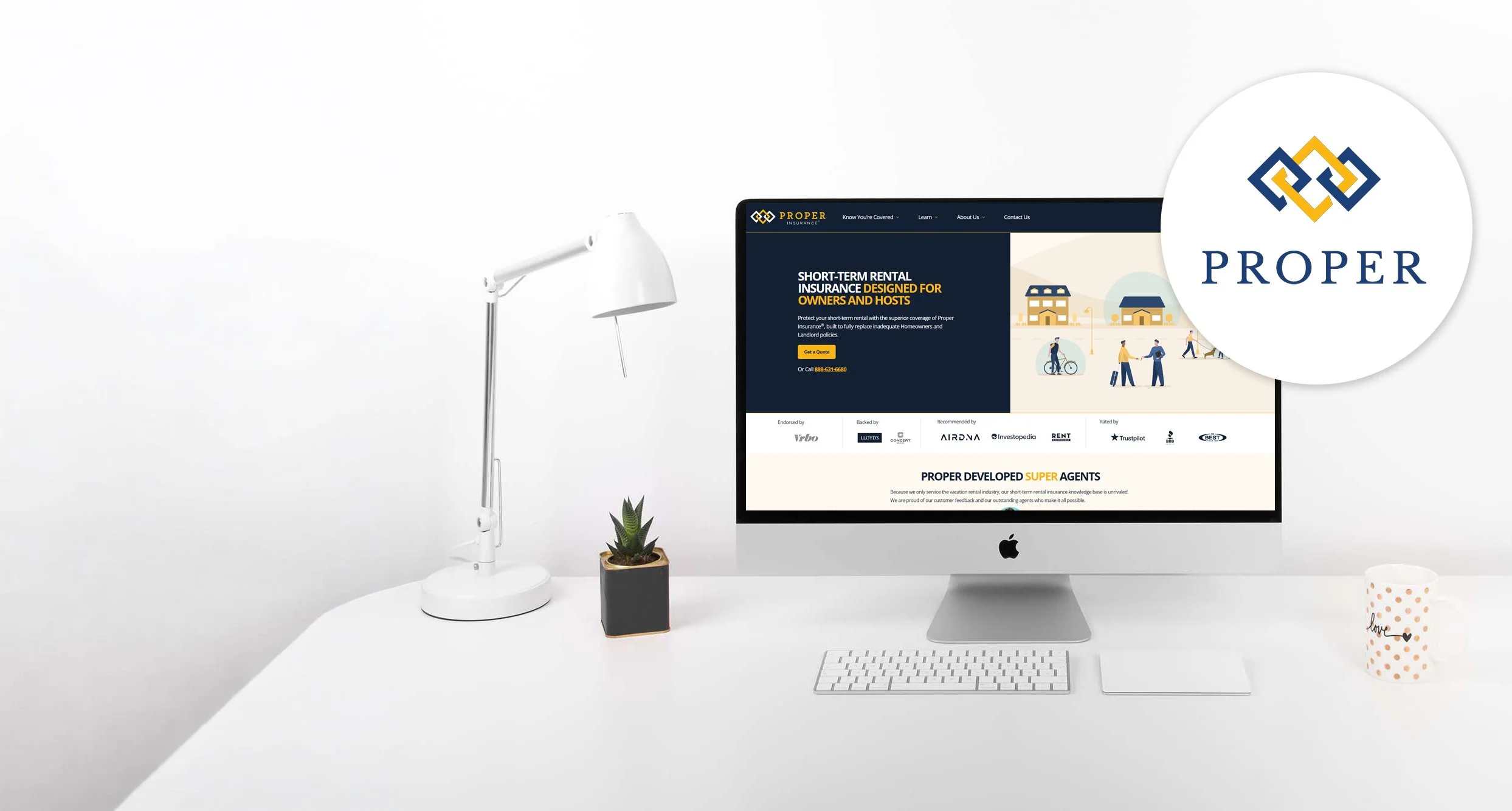
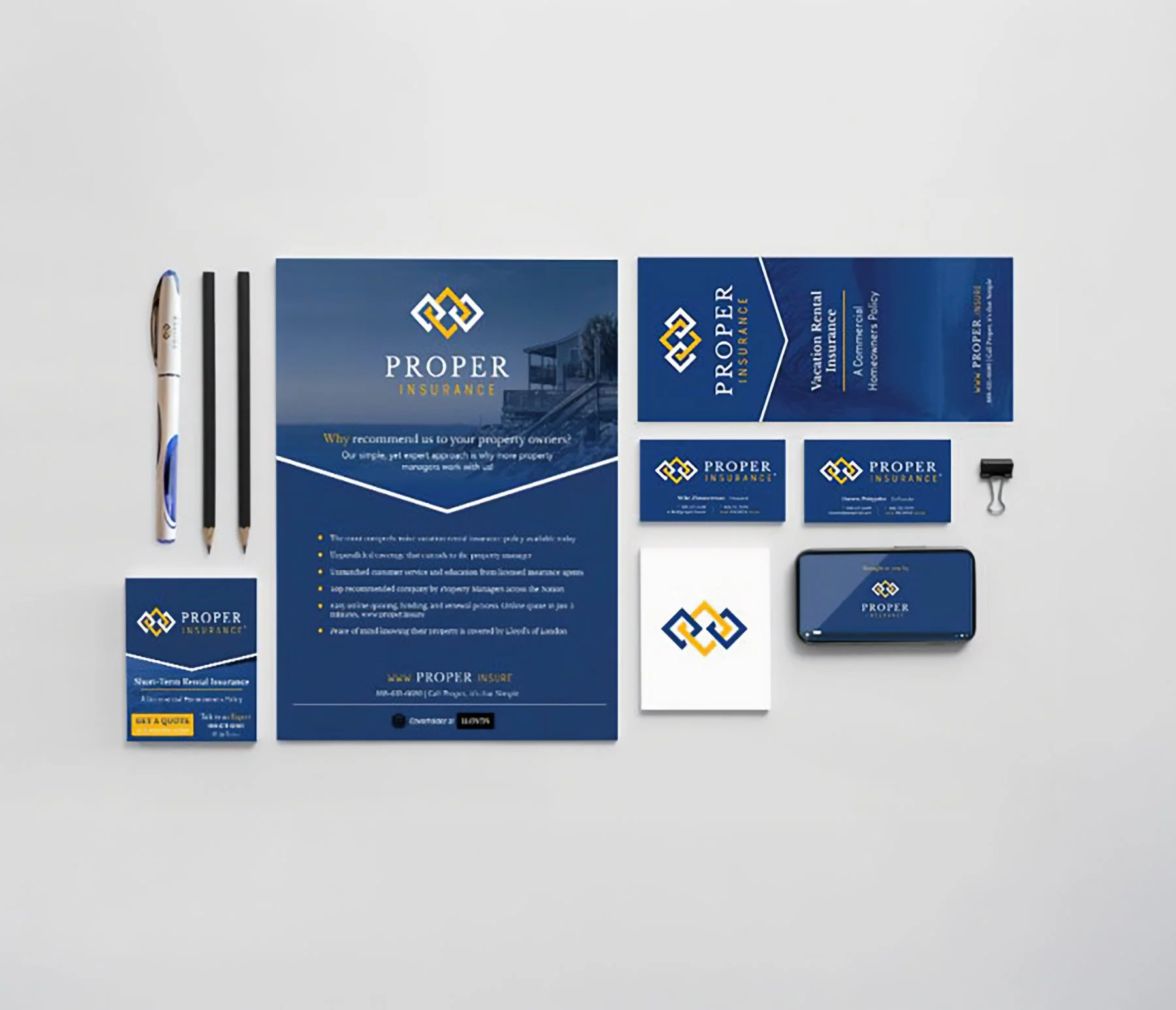
From there, I built out a cohesive visual system that could be applied across a range of collateral. This included defining typography, color usage, and layout standards to ensure consistency across all materials.
Each piece, business cards, folders, brochures, and promotional items like pens, were designed with both function and brand presence in mind. Attention was given to hierarchy, readability, and how the materials would be used in real-world interactions with clients.
Solution
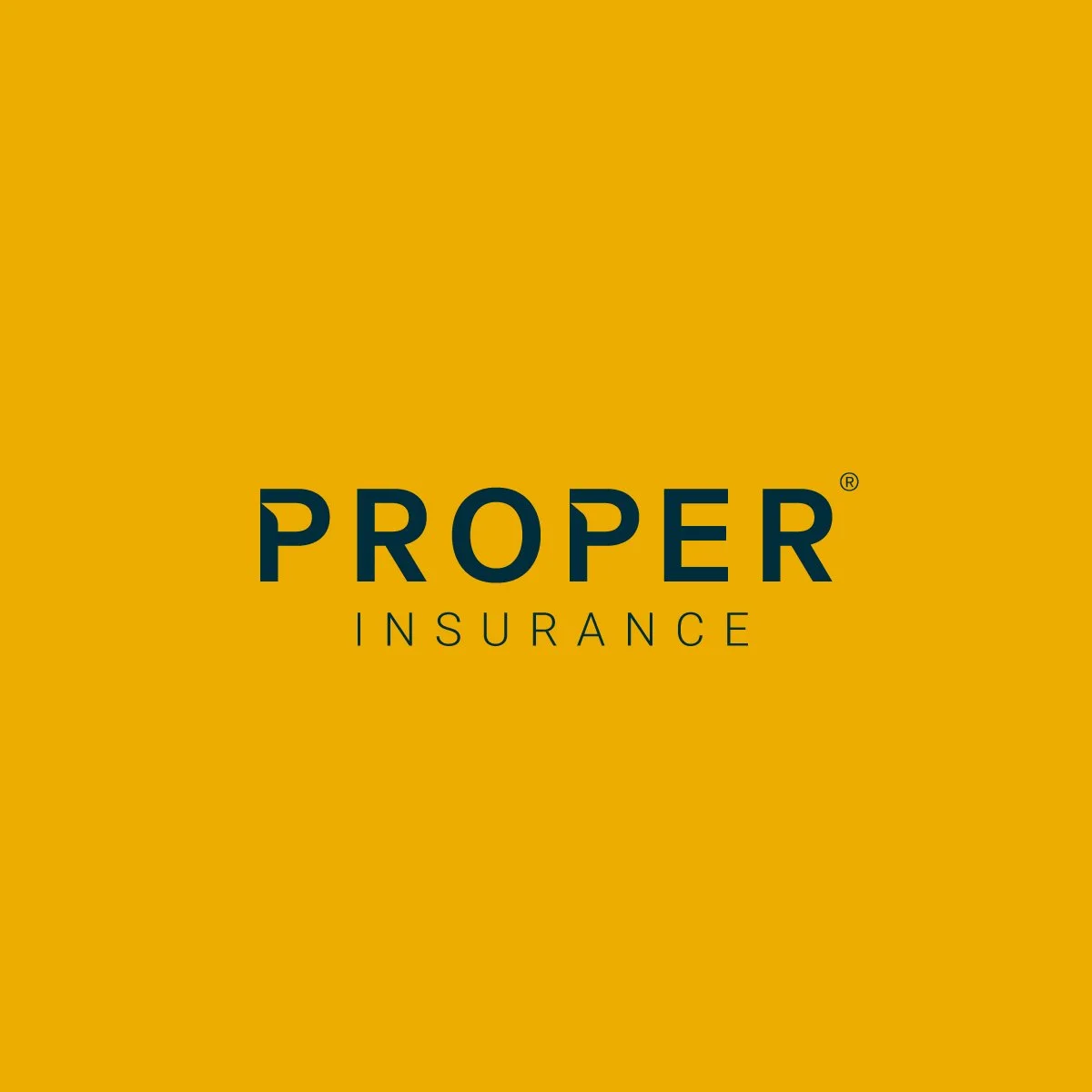
The result was a polished and cohesive brand identity that carries through every touchpoint. The new logo provides a strong, professional presence, while the supporting collateral reinforces consistency and builds trust with clients.
By aligning all materials under a unified visual system, Proper Insurance now presents a more credible and recognizable brand, enhancing both their day-to-day interactions and overall market presence.