Wildrye Distillery
Problem
Wildrye is a local distillery with a strong regional presence and a loyal customer base. While their product was well-crafted, their visual identity and packaging didn’t fully reflect the quality or personality of the brand. The existing logo and bottle labels lacked consistency and shelf presence, making it difficult to stand out in a competitive market.
Process
I began by evaluating the existing brand and identifying opportunities to create a more cohesive and recognizable identity. The goal was to maintain the distillery’s local character while elevating the overall look and feel.
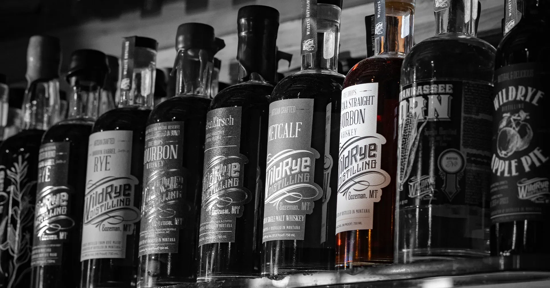
The logo was refined to feel more distinctive and versatile, ensuring it could work across packaging, merchandise, and marketing materials. From there, I developed a new label system for the product line, focusing on hierarchy, readability, and visual impact on the shelf.
Typography, color, and layout were carefully considered to create a balance between craft authenticity and a more polished, modern presentation. Each label was designed to feel like part of a unified system while still allowing individual products to stand apart.
Solution
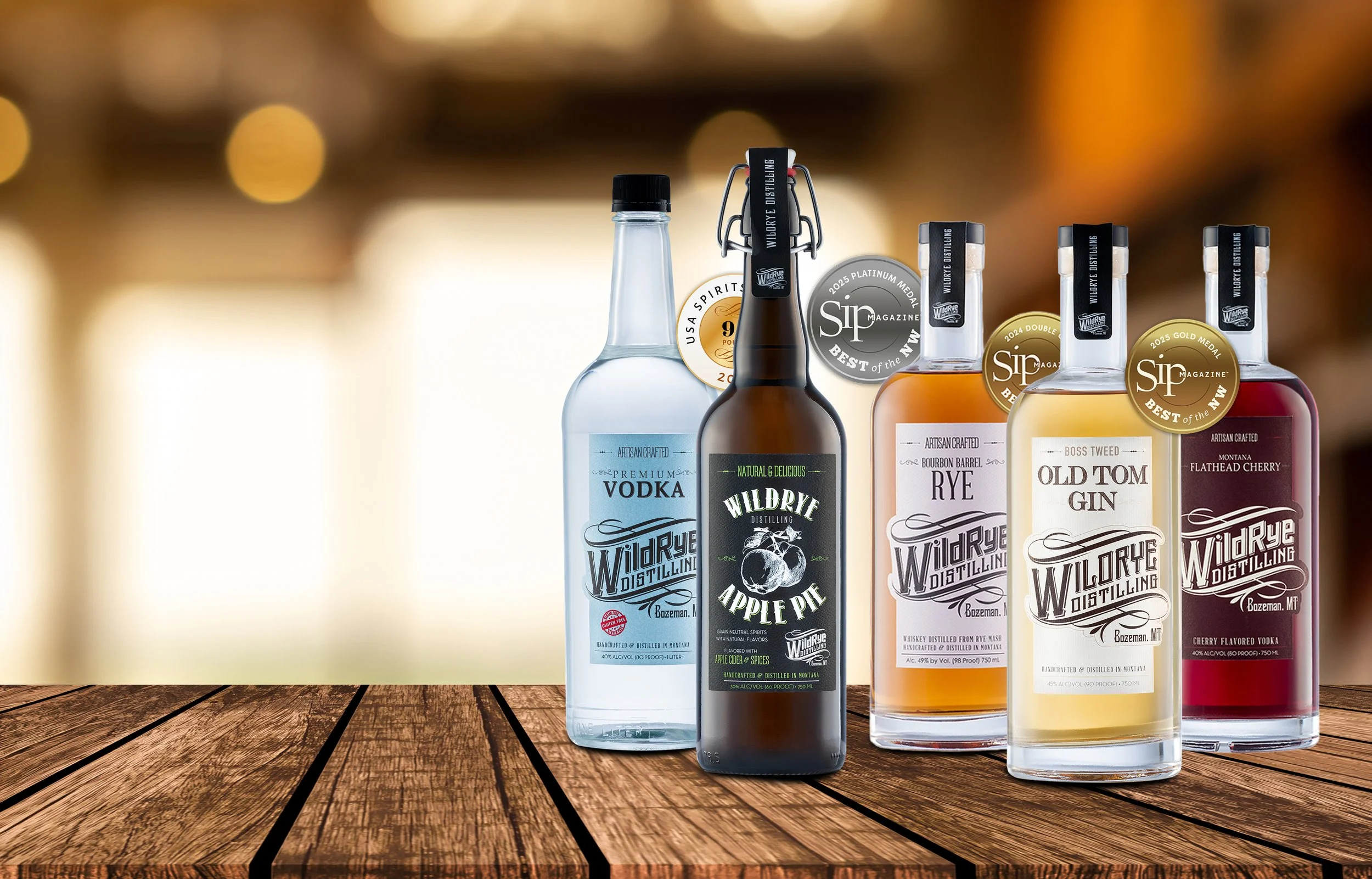
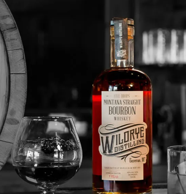
The result was a refreshed brand identity and a cohesive set of bottle labels that better reflect the quality of Wildrye’s products. The updated logo provides a stronger foundation for the brand, while the new packaging increases visibility and recognition.
The label system creates consistency across the product line, improves clarity for customers, and enhances shelf appeal, helping Wildrye stand out while staying true to its local roots.
The Atlast Project →